
PUC Pick up cabinets

Smart & connected equipment solution for contactless food order pick-up.
overview
Carter-Hoffman, a restaurant appliance manufacturer, approached us to partner with them on the PUC project. PUC is a self-serve food pick up cabinet for busy restaurants to help customers (or delivery drivers) get their order easily and quickly by just using their phone (a pin or QR code sent via text message) to open the locker.
MY ROLE
My role was designing the user experience, wireframes, interaction and user interface from concepts to shipped product. Our task was to create the software for the cabinet as well as integration of all parts which includes the cabinet, touch screen, bar scanner.
-
Product manager
-
UX engineer
-
UI designer
-
Hardware engineer
-
2 Software engineers
-
Quality Assurance
TEAM
Using a combination of Agile/scrum method and lean UX, we had 4 months to a working prototype.
timeline
We used Git for version control with SourceTree as the client and ActiveCollab for project management.
problem statement
Picking up food for busy restaurants often takes a long time and not very efficient for the customers, they should not need to wait in line to pick up their orders. The purpose of this product is to make food pick up more convenient and faster.
solution
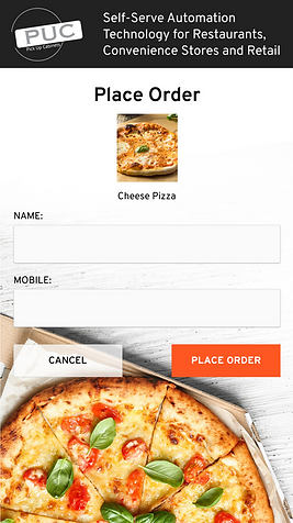
A simple pick-up cabinet with lockers with a 10" touch screen and a scanner where users can scan the QR code which they receive in a text message in restaurants, sports or concert venues, retails stores, colleges or universities, pharmacies, etc.
platform change
This project was initially built as a responsive web app (Single Page Application), but then rebuilt from ground up as a native app (Android based) using Xamarin forms for the GUI for performance and scalability.
USERS
Users of this product will be restaurant employees who will load the order and customers who frequently order food at restaurants for take away orders as well as food delivery services such as Doordash, GrubHub, Postmates, etc.
constraints
a few constraints for the project were decided by Carter Hoffman
-
Cabinets will use ELO 10" Touchscreen monitors (Android based)
-
Cabinets will have QR scanner to open lockers, but lockers can also be opened by entering code using the touch screen
-
There are heated (which means there needs to be a temperature control) and ambient lockers.
-
Number of lockers and type (heated/ambient) cabinets are customizable.
-
Location of touchscreens and scanner are predetermined by the manufacturer.
- One order can have multiple lockers.
-
There will be touch screens and QR scanner on the front (consumer) and rear (employee) of the cabinet, but employees should be able to load order from either side.
-
Use SMS for notification when order is ready for pickup.
-
Indicate available and loaded slots.
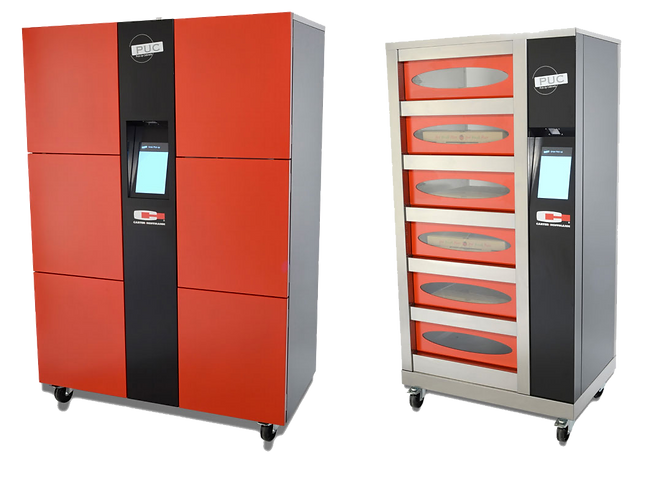
PUC heated and ambient food locker & heated pizza cabinets.
Based on previous experience we made some usability decisions.
-
Scanners are finicky, most people hold their phones too close to the scanner, need explicit instructions.
-
Need to be able to lock screen so employee can wipe/clean the screen—screens will get dirty or greasy—without accidentally changing anything.
-
Employees should have a code that they enter using keypad on the touch screen to access the manage order screen and setting from the user facing screen.
-
Phone number needs validation.
-
For pick-up and loading screens, show diagram of the cabinet for one-to-one mapping and highlight the locker that is open.
challenges
Our stakeholder wanted a working prototype (MVP) ready for a trade show and we had four months to do it including hardware & software integration which was an aggressive timeline.
One of the problems was that we had to start working without the physical cabinet. So we had to make sure we left a lot of time to figure out how the apps talk to each other.
Another obstacle that we ran into was to create an instruction for the screen with a photo of how to scan the code without an actual cabinet that consumers will see.
We didn’t have any experience seeing people actually use them, we had ideas about how things would work but there were all sorts of edge cases such as:
-
What to do if one order has 2 lockers, and only picked up partially.
-
What to do if something is taken out then something else is put in that or some other locker without the restaurant employee interacting with the app.
“...we had to start working without the physical cabinet.”
scenario
Story of a customer placing a pick-up order. For demo purposes, the system is not integrated to a POS system. We created a simple scenario to simulate how an order might be placed that helped us make decisions on flow and wireframes.

User story of a customer placing a phone order.
notes from scenario
-
There will be a loaded screen and a queued screen, we will use tabbed nav.
-
There should be a counter or table to put down order while entering info.
-
Locker numbers on the cabinet are necessary.
-
Employees should be able to get to manage order screen by using a code in case they need to operate it from the front.
FLOW
PUC has a simple goal, to help customers retrieve food from a locker by using their phone. There are two groups of users: restaurant employees and customers.
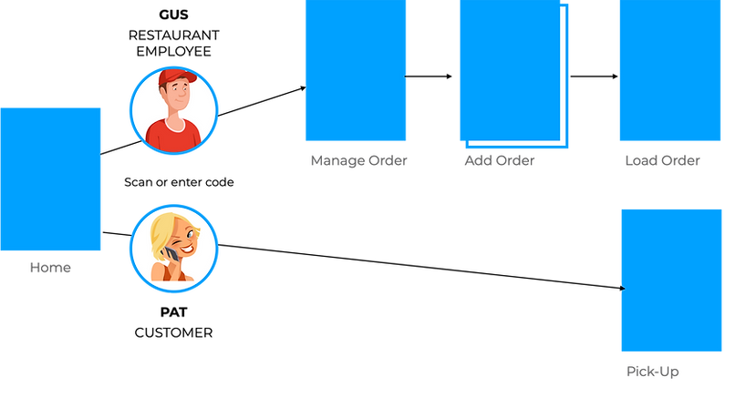
PUC flow.
early sketches

Early concept of how might a restaurant employee load an order and what a management screen might look like.

Possible flow of how to load an order by a restaurant employee.

The first prototype of the cabinet with only 2 lockers.
creating mock-up assets
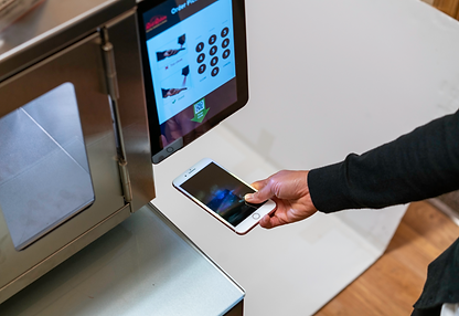
One of the sprints, an instruction photo of how to scan the code was needed, so we had to use what we had.

Early mock-up of an instruction photo concept using the initial prototype where the scanner is located below the tablet.
accomodating change
Carter-Hoffman decided that the scanner above the tablet was better with the tablet positioned vertically and slightly angled back, because of this, we needed to build a makeshift cabinet.

The location of the scanner was moved to the top. A makeshift cabinet built out of presentation boards.

Though not pretty, we got the point across.
wireframe: loading
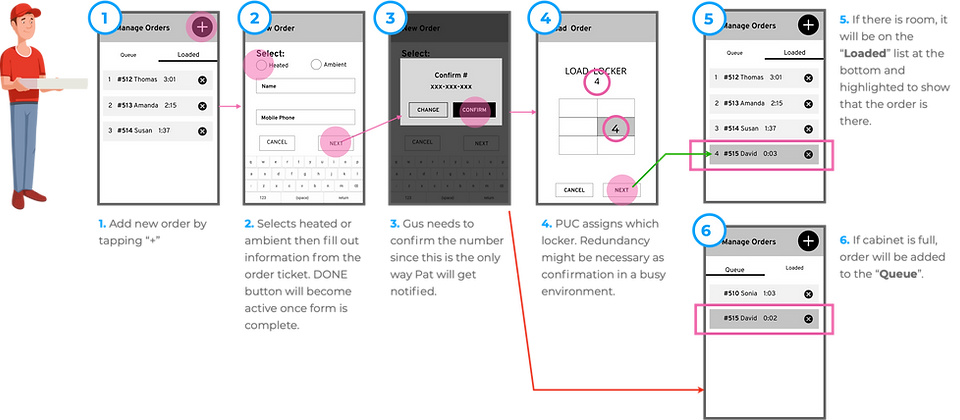
An order is loaded when there is a locker available and the customer will get notified by text message. If the cabinet is full, the order will wait for an available locker in the Queue tab.
There are two outcomes:
-
If loading is successful, the order will be in the locker ready to be picked up in which case the customer will be notified via text message.
-
If loading is not successful (cabinet is full), the oder will be placed in the "Queue" tab to wait for an available locker.
wireframe: pick up
A text message with QR code and PIN with the location of the cabinet is sent when the order is ready for pick up.

When an order is ready, the customer gets a text message with QR code to open the locker.
designing mockups
Creating pixel perfect assets.
The next step after we got the wireframes all decided was to design the mockups for the final prototype. What I thought should be a straightforward process was not at all. A can of worms was opened. There was a lot of information that I needed to fit on the screens, and I had to decide on colors to use that was meaningful or at least not confusing. I always tell myself “green means go, red mean stop”—but then I needed another color as buttons that did not mean go or stop (in this case it's delete), and already it had started to become a color fest on this 10 inch screen.
Another typical situation when going from wireframes to mockups was that while creating wireframes, I did not have to worry too much about fitting everything nicely—as long as all the elements were in the wireframes, I could design them later to make them pretty. I sometimes would also simplfy my wireframes to not include elements that I thought were obvious, such as the including the logo on the top left.

Wireframe of the loaded screen—it had all actionable elements, but missing the logo which was intentional to simplify.

Designing mockup was not as straightforward as I thought based on early sketches and wireframes. It wasn' t until this process that I realized how much information had to fit on a ten inch screen.
We also made some decisions on the fly, wireframes were never the end of it, there were always last minute additions that we felt we needed to add for better experience, many times, with not much user research. We sometimes had forgotten that we were not the users, we did what we thought were helpful and necessary.
For example, was it necessary to have “Available lockers: x number heated, y number ambient.” It might be pretty easy to just look at the cabinet to tell.
There were things I thought would work while creating the wireframes, and it became clear quickly while designing the mockup that was not the case. For example not including the logo in the wireframe, when it came time to creating the mock-up the top area became too busy with logo, page title, and two buttons.
Ideally we would have found out what did not work by spending more time to improve wireframes and lo-fi prototyping—but we needed to save time by skipping those processes. So when it came time to actually design the screens, I felt like it got too busy too quickly.
“Ideally we would have found out what did not work by spending more time to improve wireframes and lo-fi prototyping—but we needed to save time by skipping those processes.”
final screens
Loading the order is the bulk of the action, we named this screen the Manage Order screen.
Key Notes:
-
Queue: list of orders waiting for locker, order oldest to newest
-
Loaded: list of orders in the locker, order longest in the locker at the top
-
Use colors to show expired orders
-
Time stamp
-
Each order is assigned one cubby (to simplify process for the demo) to begin, but need ability to add more if needed
-
Settings tab: employees need to have a way to open all doors, set temperature
-
Need confirmation for DELETE order
pick up screen
Picking up was a simple process, however we still had to ask ourselves how might we help customers pick up their order if they cannot scan the code? The scanner might fail them, or they might not have their phone but they know the code, or they might be picking up for someone else. We had to decide what information the text message should have. Besides the QR code, the PIN number needed to be part of the message.

Customer receives a text message with QR code and PIN once their order is loaded in the cabinet.
“...how might we help customers pick up their order if they cannot scan the code?”

Customers will use the code sent via text message.
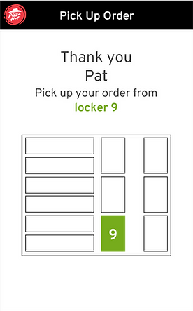
Locker will be highlighted so customers can find it easily and quickly.

Customer will the be instructed to close the locker door once their order is picked up.
manage order screen / queue tab
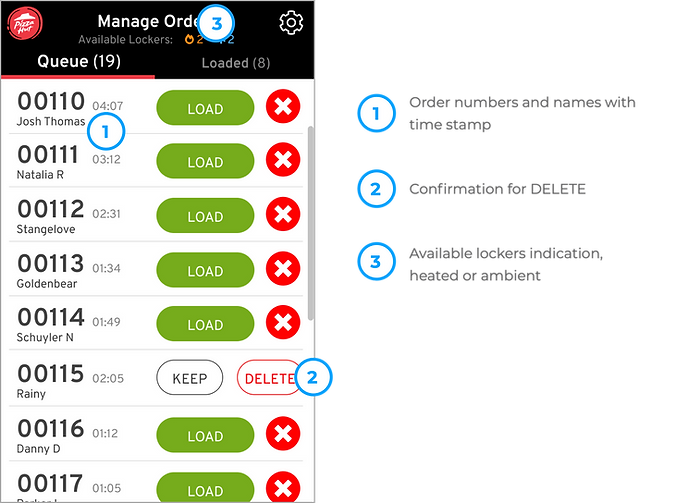
The Queue tab is part of the Manage Order screen where orders are waiting to be loaded to available locker or lockers (if the order requires multiple lockers). The list is ordered from oldest to newest.
lockers study
I experimented using colors to indicate heated and ambient.
The idea was to see if loading and adding a locker can be done without reading, we were thinking about restaurant employees who were non-English speakers. We did not go this route.

I did an experiment with using colors to indicate heated or ambient cabinet to see if I could not use words for adding lockers to help non native English speaker employees.
manage order screen / load order

Load order screen is similar to pick up screen with adding locker(s) option.
manage order screen / loaded tab

The Loaded tab is part of the Manage Order screen that shows what orders are in which lockers.
mockup in situation


Several mockup screens in situation.

Settings screen where employee can adjust temperature, open multiple lockers at once, and lock screen to clean.
POS integration


outcome
We shipped the prototype on time for the trade show.
More units were installed at various places:
-
Restaurant trades shows (US and Italy)
-
AT&T campus in Dallas TX
-
Papa Gino’s Pizza in MA
-
Boston colleges cafeterias

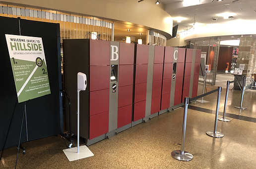
PUC installed at Pizza Expo 2019 in Las Vegas. This set up had a large monitor above the cabinet that displayed locker numbers with order names to check if their orders were ready.
This project was very timely to COVID times. What was initially a product designed to improve speed of service, labor cost, and convenient streamlined pick-up— is now also a perfect safe contactless pick-up in high traffic areas.
FIRST multi-unit INSTALL AT Boston college
Boston College plans to install PUC at five of their cafeterias. The first one was installed at the beginning of November 2020 to test. There were 341 orders through it the first full day. It was a success, the cafeteria manager loved it —“Wait until other colleges hear about this!”
All their orders come via a POS website the students order from. PUC picks the cabinet at the cafeteria with the fewest orders for load balancing, then sends the order to the PUC server. The PUC server prints out a ticket in the kitchen for them with all the items and a load QR code.
The first multi-unit installed at one of Boston College's cafeteria the beginning of November 2020. Boston College plans to install PUC at five of the campus' cafeterias. There were 341 orders through it the first full day.
CANTINA TACO BELL, times square, NY
Taco Bell opened a digital-only restaurant in Times Square on April 14, 2021.
The restaurant only lets customers order ahead or on-site at a digital kiosk. If they order ahead, they will collect their meal from a food locker (PUC).

Custom contactless pickup cabinet at Taco Bell Cantina in Times Square that opened in April 2021.
lessons learned
Not all Android tablets behave the same!
While building the product, we were using different Android tablets during development before we received the ELO tablets. Once we had them, we found out certain things that worked on the other tablet, did not work on ELO. One example was rotating the tablet. The framework used was not compatible so days had to be spent on fixing something that we thought was automatic.
Had there been more time…
I would have liked for us to do a lo-fi prototype first to make making changes to the flow or usability easier.
I would also have liked to have done usability testing at real locations to see the environments the cabinets are placed at and to see more restaurant employees using the cabinet so we could make it better.